Two case studies, built in code
Product interfaces, designed and built in code.
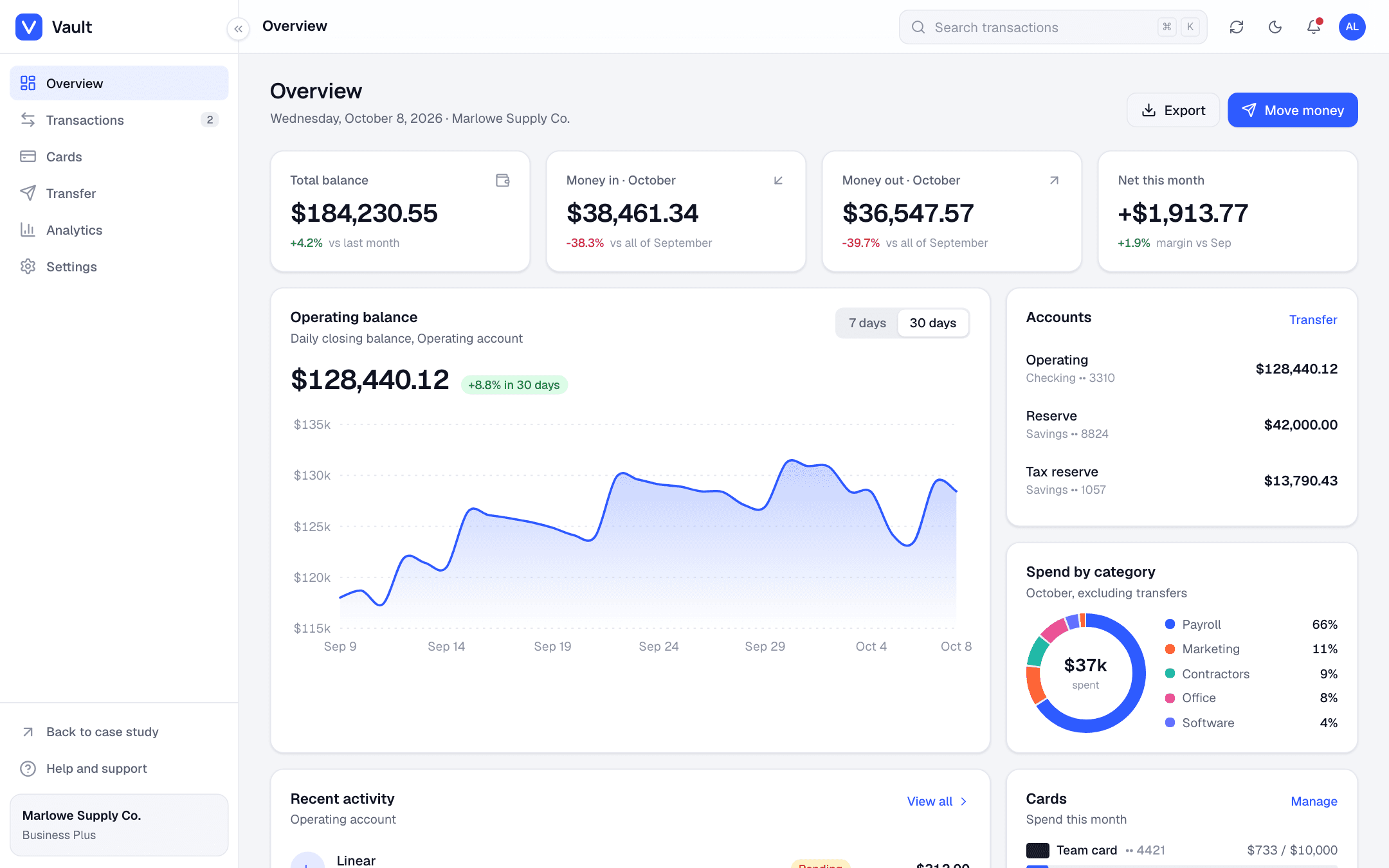
Vault is a banking dashboard for small businesses. Stride is a fitness app for the phone. Both run in the browser with real filters, forms, charts and loading states, in dark and light. Click around. Resize the window.
No sign-up and no backend. The data is made up and resets when you reload.
- 11screens across the two products
- 16components shared between them
- 2themes, dark and light, following the system
- 0chart libraries. Every chart is hand-drawn SVG
Business banking dashboard
Vault
Banking that a twelve-person company can run from one screen.
Context
Marlowe Supply Co. is a fictional wholesale business with three accounts, three cards and a bookkeeper who checks in once a week. The owner wanted to see cash, pay people and catch problems without opening five tabs.
The problem
Most small-business banking dashboards bury the useful numbers under promo tiles. The brief went the other way: show the balance, what came in, what went out and what needs attention, then get out of the way.
What was delivered
- Overview with a 30-day cash trend, spend by category, card limits and pending items
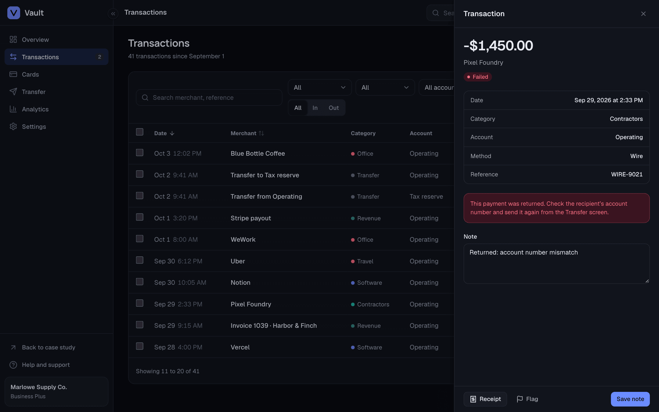
- Transactions table with search, filters, sorting, pagination, CSV export, bulk actions and a detail drawer
- Cards: freeze, monthly limits, spending controls and virtual card creation
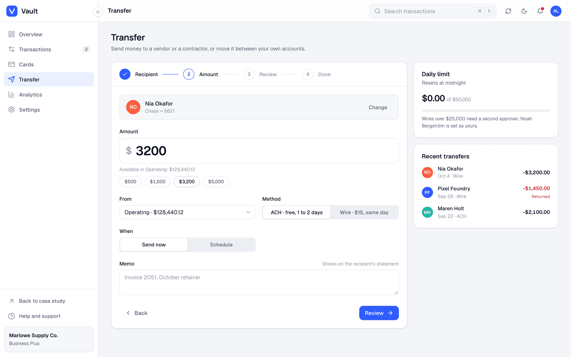
- Four-step transfer flow with validation, review and a confirmation screen
- Analytics, team and notification settings, dark and light themes
Built with
Next.js, TypeScript, Tailwind and Motion. Charts in SVG. Desktop first, usable down to a phone.
Mobile fitness app
Stride
A fitness app that asks for one glance a day.
Context
Stride is a fictional consumer app for people who walk and run a few times a week. It tracks steps, workouts and sleep, and it was designed for the phone first.
The problem
Fitness apps tend to shame you with streaks and red numbers. Stride had to feel calm: big rings, plain language, goals you can change in two taps, and nothing that nags.
What was delivered
- Three-step onboarding with goal picking and reminder preferences
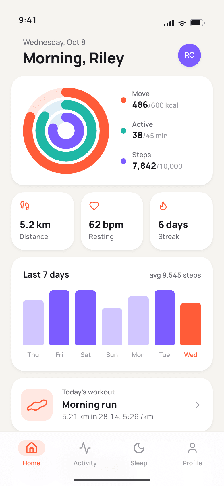
- Home with activity rings, a seven-day chart and today’s workout
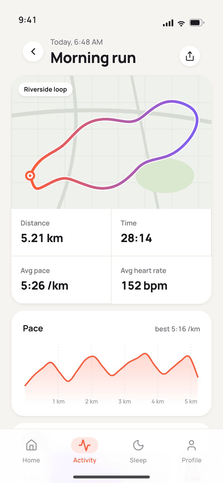
- Run detail with route map, pace curve and kilometer splits
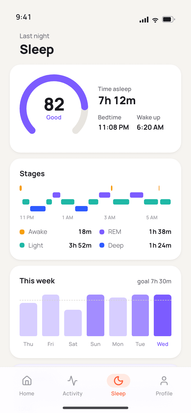
- Sleep with score, stage timeline and a weekly view
- Profile with steppers, segmented controls and toggles, plus a tab bar with page transitions
Built with
Same codebase and components as Vault. Runs at 390 by 844 inside a phone frame on desktop, full screen on a phone.
Build notes
What a client gets when they hire for a product interface like these two. The short version: one codebase, every state designed, nothing that only works in a screenshot.
- One component set, two products
- Buttons, inputs, selects, dialogs, drawers, dropdowns, tabs, toasts, switches, skeletons and badges live in one folder. Vault and Stride differ by a dozen CSS variables: colors, radius, shadows, type.
- Every state is designed
- Skeletons while data loads, an empty state when a filter finds nothing, inline errors on forms, a success screen with a reference number, and toasts for anything that happens in the background.
- Charts without a chart library
- Area, bar, donut, sparkline, activity rings, a sleep timeline and a route map are plain SVG. They scale to any width, pick up the theme colors, and the hover tooltips are a few lines each.
- Motion that earns its place
- Page transitions in Stride, spring tab indicators, rings and routes that draw in once. Nothing runs longer than about a second, and the reduced-motion setting switches it off.
- Keyboard and screen readers
- Visible focus rings, Escape closes dialogs and drawers, Cmd+K jumps to search. Every icon button has a name, and charts are labeled or paired with the same numbers as text.
- Works at 390 and at 1440
- Vault keeps a collapsible sidebar on desktop and swaps the table for a list on a phone. Stride runs full screen on a phone and inside a phone frame on desktop, same code either way.